Friday, 30 April 2010

Final Post!

At last, my blog is finally complete! I hope you enjoy viewing it!

Sunday, 18 April 2010

Final Editing and Alterations

The production team and I had no viewed our music video in a long while due to focusing on our ancillary tasks, however we recently viewed our video and realised we needed to make final alterations that we did not consider before. We came to realise that the lip syncronization was not precisely in time to the music. We were in a dilemma on deciding whether we should speed up the scenes on certain clips or not, however we gathered useful advice from our media teachers and came to the conclusion of replacing the lip syncronization scenes with other scenes and clips. On the other hand, another criteria of the music video which was not originally included was adding in credits to introduce the song name and band name. Therefore, I have uploaded our original final version of 'Superman', and the actual final version which will be sent off to the moderators.

Originally, the final music video

Final Music Video

Friday, 16 April 2010

Lip Syncronization


Andrew Goodwin states that incorporating lip synchronisation means the performer is addressing the audience directly embracing them whereas in films the audience has a voyeuristic relationship with the actors. This is the main reason in which the production team and I used lip syncronization, the clip are the first two clips of this set of scenes.

Thursday, 15 April 2010

Choices of Style

Throughout the construction of our promotional music video, the production team and I kept analysing the various elements in music videos to relate to ours so that we are using the conventions for music videos in our pop/rock music genre. I personally, noticed that in Avril Lavigne's music video ''Sk8er Boi", she uses various aspects which were used in the creation and development of my music video, which also helped us to make final decisions:

- There is the use of an urban area which is made apparent in outside shots to establish the setting.

- There is a narrative throughout the music video, which is to do with boyfriends/girlfriends/relationships.

- Characters are of the same age (teenage)

- There is the use of teenage stereotypes such as the ''grunger/goth/skater boy'' and the fashionable and popular girl, who could also be stereotyped into the group of ''cliques''

- The ''skater boy'' wore dull, black clothing, which helped us to come to a final decision that black would be the best colour for the ''goth'' in our music video. This was made apparent in society within the stereotypes, and this particular music video reconfirmed this.

- This music video shows youth like behaviour such as messing around with cars and acting animal like in the street, we related the theme of showing youthful behaviour in our music video by releasing it through the youthful and fun side to relationships instead since that was what our narrative was based on

- The lyrics during the music video syncronize with the narrative through having scenes which reflect the lyrics narrative, for example ''he was a punk, she did ballet, what more can I say?''. During these lyrics scenes consisting of the ''punk'' and the ''clique girl'' were present, we also did the construction of our music video in order to make the storyline as unambiguous as possible.

Tuesday, 30 March 2010

How effective is the combination of the music video, digipak and magazine advertisement altogether?

There is the use of stong synergy between my digipak and magazine advertisement due to very similar imagery, design and layout. This would help the audience to relate the digipak and magazine advertisement to the music video.


As the music video tends to attract a wider range of female audiences opposed to make, I initially set out to gain an audience of equal males and females. Therefore, by doing this, I thought that the music video could attract mainly the females whereas my digipak and magazine advertisement could attract the male audience to balance out the male and female audiences. The colours used in the digipak and magazine advertisement are less vibrant than what would be expected when viewing the music video, therefore contributing to the attraction of a male audience. However, the use of the symbolic imagery of the guitar helps the digipak and magazine advertisement to collaborate with the music video as the music video is quite 'rocky'.

Also, there was the use of similar texts throughtout the digipak and magazine advertisement. This, of course, did not make an appearance in the music video, however I thought that the font 'impact' which I used was bold and captivating and held a sense of authority with the boldness. Also, the outline holds connotations of lightning, which relates back to the name of the band. Additionally, I thought that this particular font could help contribute to enhancing the music genre, as rock music is at times outstanding and is noticed straight away with the sounds of the guitars, therefore I thought this font illustrates this relatively well.

Furthermore, on the magazine advertisement, there is a range of different sized fonts, more so than the digipak. I thought that this could relate to the different camera shots in the music video as the production team and I made use of long shots, mid shots, close ups and others. The audience may not necessarily relate the different sized fonts to the camera angles, however this is what I intended when changing the size font in the different phrases on both the digipak and magazine advertisement.

Lastly, the grey background colourscheme on both the digipak and magazine advertisement is very plain and simplistic, however with a feel of freedom due to the wide spacing. This, I intended on illustrating the freedom in which the female protagonist character had in a patriarchal society. This illustrates the sense of power and freedom which is emphasized throughout the music video, especially with the wide amount of spacing on the digipak and magazine advertisement.

What have I learnt from my audience feedback? - Magazine Advertisement

To gain reliable audience feedback, I thought it would be suitable to use closed questions as this enables me to represent my results in graph format, however open questions I will also use to gain valid data which is representative to have an idea of the personal opinion of some people from my audience. I prompted my closed questions on networking websites again such as MySpace and Facebook. I posted three main, simple questions for them to answer in questionnaire format, and sent it to 10 people.

The results came out rather well as all the 10 candidates which I posted my questionnaire were able to reply to me and post the questionnaire back in time for me to analyse my results and convert them into graph format.


The question illustrates that all 1o of the candidates taking part in the questionnaire agreed that there was a strong link between the appearance of the digipak and the magazine advertisement. This shows that I have created a strong synergy between them both so that the audience are immediately able to recognise what album is being advertised.

The answers to this particular question were slightly ambiguous as nearly the same amount of candidates have agreed to each answer made available. Therefore, due to this reason, I might make this an open question which I will prompt my audience with to gain reasons for their choice of answer.

This question is also slightly ambiguous, however the logical reason for the answers to these question could be due to the fact that many of the people who answered these questions may not have the preferred music genre which the magazine advertisement clearly demonstrates with the use of symbolic imagery.


Open questions...
I also asked my audience a range of open questions to gain valid data, I again used networking websites such as MySpace and Facebook. I prompted them with 2 main questions in order to gain their feedback. The three main questions in which I prompted them with was:
1 - Do you think the magazine advertisement uses conventions which make you want to purchase the album?
2 - What would you improve about the magazine advertisement?
3 - Would this magazine advertisement catch your attention if pinned up in a music store?
Responses...
1 - The majority of my audience feedback make me realise that my magazine advertisement does in fact use conventions which would make my audience want to buy the album. One of the candidates responses was that "The use of the out now sign made me want to purchase the album because it brought a wave of excitement". Another candidate responded with "I liked the way in which you made use of quotes from other music magazines as it shows that they approve and recommend the album". These were along the same lines as what the majority of the audience feedback had made me aware of. Also, this were features of my magazine advertisement which I made intentional, this shows me that my intentions were a success to my audience. On the other hand, one of the responses I received was that "...I did not quite understand why you included the fact it was available in HMV when this would be expected anyway as this store sells most albums which are new". I understand why this candidate may reply with this particular quote, due to what they are saying is correct, however I intended on using the fact that this album is available in HMV to include the promotion of industries as a way of collaborating with something else associated with the album. However, if I was to make any adjustments to my magazine advertisement, I may not necessarily include this particular convention again.

2 - The majority of my candidates all agreed that my magazine advertisement was very simplistic in terms of the overall image, however the reason in which I did this simplistic image was because in the creativity stages of my advertisement, my audience feedback made me aware that a teaser type image was not necessary. One of the candidates quoted "...the image of the magazine advertisement is very simplistic, maybe another symbolic image could be a way of making it more jazzy". Due to this being a response, if I was to re-edit my magazine advertisement to make any adjustments, I would try to imclude another image to make it a little more appealing than what it already is, as this could represent a surprise within the album, which could relate to the bonus tracks, which you do not always find in albums. Additionally, the majority of my audience feedback made clear that they liked the advertisement, but they would possibly make the album title stand out more than it does, as this may not be the main, most noticeable feature to someone skimming through many advertisement. One of my candidates responded with the answer "The album title is in the same font as on the digipak which illustrates the correlation, however this could have been exaggerated a bit more in the advertisement as this, of course, is the main feature which you are trying to sell". This, I thought was in interesting response, because the font I believe is not that much similar to that of the artists name, which make the equally as stood out, when in fact it is a magazine advertisement convention for the album name to stand out more. Therefore, if I was to make any adjustments to this in the future, this would be a main adjustment I would work on.
3 - Many of my candidates responses replied to the third question in a varied way. For example, one of my candidates said that "My preferred music is not that of pop/rock, but due to the symbolic imagery, I would definitely notice this magazine advertisement if it was pinned up in a shop if this was my favourite music genre". This was my intention, therefore this specific response did not necessarily come as a shock to me. However, a response that did come as a shock to me was when one of the candidates replied saying "Even though my favourite music genre is r'n'b, this magazine advertisement stood out to me because of the colours, as these colours are very popular on r'n'b related aspects.". Because of this response, I was in a way shocked as I was not aiming to catch the attention of someone who was not that interested in the pop/rock music genre. However, this response has made me realise that my magazine advertisement could possibly appeal to more than just my intended audience. However, as this candidates points to the colourscheme being a factor that stood out to them as this was a feature was relatively popular on the r'n'b music genre, this could be considered to have challenged the conventions of pop/rock.


Sunday, 28 March 2010

Using, Challenging and Developing Conventions - Magazine Advertisement


Before the creation of my magazine advertisement, I researched into a range of advertisements to see the generic conventions, and I made a list of them. When doing this, I look at all music genres when researching the conventions of the advertisement and I came to notice that the majority of the advertisements, no matter what genre they were, had similarities in their layouts and the conventions they used. By noticing these particular conventions, I put them into practise on the construction of my own magazine advertisement. However, I did notice a few conventions which were precise to the pop/rock music genre.


Using conventions...
There was necessary conventions which were apparent on all magazine advertisements which I had to take into consideration. For example, the name of my band, this was to ensure that the audience was not to forget who the band was as they might look directly to the name of the album and forget the artists. Even though there is the clear link between the music video, digipak and magazine advertisement, I thought it was still essential to have the name of the band on the advertisement. Also, the 'OUT NOW' sign is a convention on many magazine advertisement. Various advertisements promote the release of their album in different ways such as giving an actual release date. However, I decided to have 'OUT NOW' as in my opinion, this will give the erge of excitement and captivation immediately, especially as it was in the colour gold which stood out across the advertisement. Also, my audience feedback before the creation made me aware that this is what the majority of my audience would prefer to see as the excitement of the album being able to be bought is captured immediately. Another convention which I illustrated was the website address written relatively small at the bottom of the advertisement. This is able to help build up a rapport with the band and the fans as this shows signs of contact between them both. Also, this helps to give the fans any extra information in which they want but are unable to gain from anywhere else. Additionally, due to the fact that technology helps to integrate people across the world, this would be a way of promoting the band worldwide. Furthermore, I noticed on a few advertisements such as Midlake's ''The Courage of Others'', there was quotes from music magazines to show that the album had their approval and that it was in fact a great album. I furthered this convention and included it on my own magazine advertisement to show the audience that this album has gained the appraisal from well known music magazines such as 'Q Magazine' and 'MOJO'.

Developed conventions...
Not necessarily conventionally, some magazine advertisements have the name of the music store in which the album is available to be bought at. As a result of noticing this convention was not apparent on the majority of magazine advertisements, I decided to develop this convention and make it apparent on my own advertisement. Therefore, in the bottom right hand corner, it states this this album is 'HMV exclusive'. This could possibly make the audience more eager to go out right away to purchase the album.

Challenged conventions...
There was not any particular magazine advertisement conventions that I challenged, however originally at the beginning of my creativity of the advertisement in the stages of my initial ideas, I was contemplating on whether to include a teaser type image which relates to the symbolic imagery, as this was challenging the conventions of magazine advertisements as this was a very rare convention. However, my audience feedback proved that this idea was not necessary therefore I did not end up doing this.

Friday, 26 March 2010

Editing Cont...(Part 6)

Today, the production team and I managed to finally complete the construction of our music video. Of course, we faced problems, however we managed to overcome the simplisticness of these and come to a final completion. We again, used our storyboards in the help of finishing off the finishing touches.


Special Effects used:


- Fade to black...


We used this effect to end the music video to represent that the relationship was ongoing even though the music video came to an end. This is an editing feature which the group and I witnessed when doing further research on music videos of our genre. For example, in 'Sk8er Boi' by Avril Lavigne, this editing technique was present.


- Speed...


In many areas throughout the music video, the speed was always being altered. This was due to the powers and excitement of the marvel comics being expressed in our music video to recreate the feeling of 'Superman'. Also, this generally, at times, helped to make the clip move at the same pace as the music lyrics. Also, this editing technique was not a common feature for our music genre, therefore we are challenging the conventions of pop/rock.


- Cartoon...
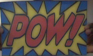

We again, made much use of the cartoon effect as this portrays the narrative of the Marvel comic books, especially that of 'Superman'. We also made use of this effect in certain unusual scenes, such as sccenes that contain unconventional camera movements such as the scene where the 'Superman' is on the roundabout and is spinning rapidly. This could also relate back to the powers of 'Superman' from the comic books.

Wednesday, 24 March 2010

Final Magazine Advertisement


Here is the final draft to my magazine advertisement. I used all the conventions of what I drew on the draft of the magazine advertisement. Also, as a convention that I wanted to include in the final outcome of my magazine advertisement, I wanted there to be a short description of the album, therefore, I used quotes from other magazines such as MOJO and Q magazine to illustrate that the album has the approval from other music magazines and industries. This should make my audience feel confident when buying the album if they were to see this advertisement casually. Also, in the right hand bottom corner, it says that the album is available to buy in HMV music stores, hopefully resulting in this shop gaining more business.

Friday, 19 March 2010

Magazine Advertisement - First Draft

In the process of drafting my magazine advertisement, I did a hand drawn draft first and decided to annotate it to put across why I used certain conventions of magazine advertisements. Also, this helps me to relate back to an image when using Photoshop to edit my final draft of my magazine advertisement.


Thursday, 18 March 2010

Magazine Advertisement Questionnaire - Results

Due to posting my magazine advertisement questionnaire on the networking websites Facebook and Myspace, I was able to receive my questionnaire results within four days. (I noticed that my results were gained quite promptly when devising a questionnaire for my digipak and music video when posting them on these particular websites, which is why this has become a regular habit). I posted my questionnaire to 18 respondents, however, I only received 15 out of the 18 respondents results. This was not necessarily a problem as I had gained the majority of my audience's feedback, also, 15 is a a more rounded up number of respondents compared to 18. I decided to structure my results in graph form, which makes it appear relatively qualititative, this enables me to make comparisons on which respondents prefer which alternatives.


The results gained from question one on my questionnaire, is that the majority of my respondents prefer my magazine advertisement to consist of the same background as on my digipak. Therefore, this is my first initial idea in the construction of my advertisement. The audience's feedback makes clear that they prefer to see the synergy between the digipak and the magazine advertisement so relate to one another when in the public eye. Personally, I would also agree with the majority of the respondents.

On question two of the questionnaire, the majoirty of my audience feedback answered that my magazine advertisement should also consist of the same font and images as on my digipak. Therefore, I am planning on having a similar layout on my front cover, as on my magazine advertisement. By doing this, I am using my audience's feedback as my guidelines of including the electric guitar alongside the bold, black writing. This will instantaneously make my audience see the link between the digipak front cover and the magazine advertisement.

When I was looking at the generic conventions of magazine advertisements, I noticed that every music album being advertised had a release date on the advertisement, or 'OUT NOW' or 'OUT SOON'. I decided that I definitely want to include one of these three, however I was unsure as to which particular one. So, I added this question on my questionnaire, and it seems that my audience would prefer to see 'OUT NOW'. As a result, I am planning to include this as my magazine advertisement.
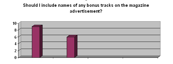

Clearly, my audience would like to see what particular bonus tracks will be included on 'The Lightning's' album through the magazine advertisement. Therefore, I will make sure that this is included. However, as 9 people out of the 15 preferred this alternative, I still wish to take into consideration the opinions of the other 6 respondents which did not think that bonus tracks were that important in the advertisement of the album. So, I have decided that I will include only one bonus track on the magazine advertisement instead of the two. This way, I am trying to compromise with both oppositions of my audience's feedback.


My audience feedback has shown me that a teaser type image would not be that necessary. This, I was in fact surprised with, therefore I asked personally one of my respondents who thought that this was not necessary why they thought this, and they replied ''This would not show a correlation between the advertisement and the album cover as the album cover has a simplistic design and layout''. This made me realise that this was in fact true, especially with a front cover such as mine. As a result, I shan't use this convention. I also have come to realise that this convention is very rare, which shows a sign of uniqueness, however, as it is such a rarity, some people may not resemble it as something which should appear on something such as a magazine advertisement.


Exactly as I thought, my audience respondents have made a preference of wanting my magazine advertisement to be similar to my album cover. Even if I did not devise a questionnaire, this is something I would have made a decision on as the majority of the magazine advertisements I have viewed shows a very strong correlation with the album it is advertising.

Sunday, 14 March 2010

Magazine Advertisement Questionnaire


To be able to create a magazine advertisement that would be suitable for my target audience, I thought it would be a good idea to gain some audience feedback before the actual creation of it. Therefore, I know what particular conventions to use to gain my audiences attention as they would have had some input on my final draft. Again, I will post this questionnaire on networking sites such as MySpace and Facebook as by doing this, I will be able to gain my audience feedback at a faster rate compared to giving them to people in person to fill out.

Friday, 12 March 2010

Relation to Magazine Advertisement

Today, I was in HMV, and whilst I was glimpsing at albums, I straight away noticed that Seasick Steve's album stood out at me. This was because one of my magazine advertisements analyses was for his album and I immediately noticed the synergy between the actual album cover and the magazine advertisement. This is how I want people to notice the relation between my digipak and my magazine advertisement - the way I did with Seasick Steve.

Friday, 5 March 2010

Representation in Music Video

Due to our A2 exam being based on our coursework productions, the class decided that it was compulsory to begin looking at the different concepts which had a chance of being brought up in the exam. In one section of the exam, we had to focus on either our foundation portfolio or our advanced portfolio when analysing the coursework. There was the possibilities of one of the exam questions being based on genre, narrative, representation, audience and media language. We decided to look at representation in particular, then later on begin analysing the other concepts of our coursework productions. I decided to focus my analysis on my advanced portfolio for the exam due to it being fresh in my mind. I looked at the aspects that I wanted to represent, then looking at how I represented them.

- Typical teenage girl : She could make her own choice as to who she wanted to go out with. She appears dominant. Use of male gaze as shots of her chest are used - also adds to the dating atmosphere (subverts patriarchy) - female dominance.

- Three male stereotypes : Used the idea of the signifier and the signified (Saussure) with the costume designs such as ''glasses'' for the ''geek'' and black eye make up for the ''goth''. Cutting is also used to represent difference between the stereotypes.

- Youth : Swings in the playground represent young activity and having fun. Also cartoon effect is used to represent child like features, however also links in to the genre and the name of the song.

- Class/region : Represents urban area when walking down the streets as streets are relatively wide with buildings in the background (wide shots used) and people walking casually down the road.

- Sexuality and relationships : Appearing that straight relationships as the norm as there is no sign of homosexuality (two shots used to emphasize this)(romantic effect also used to represent the norm for the use of romance in heterosexual relationships).

- Ethnicity : Coincidence that the ''Superman'' was of the same ethnicity as the protagonist female character.


Many of the ways in which we emphasized our representations was through the idea of the ''signifier'' and the ''signified''. This idea was developed by Ferdinand Saussure in which the signifier was the physical aspect of something and the signifiedis the meaning attached to the signifier which makes people immediately understand what the physical aspect is associated with.

Roland Barthes took Ferdinand de Saussure's ideas and consolidated onto them. He called the way these signifiers were organised and put together the ''symbolic code'' if the text.

Monday, 1 March 2010

Using, Challenging and Developing Conventions - Album Cover


-In order to evaluate the way in which I have used, challenged and developed conventions of real media products on my album cover, I thought it would be influential if I compared my final album cover to that of Avril Lavigne's album cover "the best damn thing" as she was my main inspirational music artist of a pop/rock genre.
Using and developing conventions...
-Firstly, both album covers have a similarity of using a bland coloured background to make the actual album cover elements more unambiguous to the audience, which resulted to be very successful, according to the comments I received off of my peers in my media lesson. A few quoted that "it caught my eye subconsciously" and "I noticed the graphic use of art instantaneously". This made me feel confident about using this particular convention from Avril Lavigne's album on my own album cover. Also, I did not realise until evaluating my album cover and comparing it to Avril Lavigne's album "the best damn thing", that the font used on my album cover for the name of the band, "The Lighning", was also similar to that of Avril Lavigne's font of her name. This is a relatively bland type of font, however it could be a way of illustrating the originality and individuality of both the "The Lightning" and Avril Lavigne as an inspirational teenager pop/rock princess. Another factor which is similar for both album covers, is the way in which both covers stick to the specific colourscheme, which only consists of a few colours. This can relate to the theme of the music genre, as rock music generally uses a few instruments on stage when performing in front of an audience, which is on most occassions a set of drums a possibly 2 guitars at the maximum. Therefore, each colour could represent a musical instrument. Additionally, the parental advisory label which appears in the left hand bottom corner of "The Lightning's" album cover is a well known convention on many album covers of all genres. Therefore, I decided to use this convention as a way of making the album cover appear more realistic.
Challenging conventions...
-Ways in which there is a constrasting view, is the fact that in my album cover for "The Lighning", there is the use of graphic art, whereas Avril Lavigne's album cover only consists of an image of herself with a straight face, which could also be considered as ''moody', which is a stereotypical portrayal of teenagers. However, usually on most pop/rock album covers, there is never only one image of something which represents the band, which I decided to demonstrate on mine. This was my attempt of challenging the conventions of real album covers of a pop/rock genre as this is a very differentiating convention I decided to experiment with. I decided to put this into practise as it would make apparent instantaneously the genre of music of my album. Also, I wanted to see if it would attract people whos preferred genre of music is pop/rock as this would not be the average pop/rock cover. I have come to also realise that Avril Lavigne is also challenging the conventions of a pop/rock album cover as the front cover is focused on her, especially with the white background to make her stand out even more, this is a convention used by mainly R'n'B albums such as Taylor Swift's ''Fearles'' and Rihanna's ''Good Girl Gone Bad''.
To conclude...
-Overall, I feel that the creation of my album cover has worked relatively well with the combination of my music genre, also in using the conventions from real media products of the same music genre to help "The Lightning" progress into a successful and youthful band.

Saturday, 27 February 2010

How was media technology used in the research, planning and construction stages of my music video?

During the formation of my music video, media technology was used in a number of ways. This varied from using hand held cameras alongside the tripod, which was an element of a stage of construction where media technology was a crucial aspect, to using the internet to research images which relate to our music genre, which was used for simple tasks. Overall, media technology was used through vital stages of the contruction and assembling of the music video, however at other times, media technology was used to my advantage as it was simple an option instead of something which was crucial.

Research...
In the process of researching what music genre would be most suitable for the production team and I, we all agreed that using media technology to conduct our research was very essential. For example, we analysed all the most popular genres of music in today's contemporary society. We came to the conclusion that the most listened to genres of music were Pop, Rock, Hip Hip, R'n'B, Alternative and Indie. We were able to draw this conclusion by listening to a range of radio stations, also by watching various music channels. To be able to get the widest range of music channels and radio stations we made use of 'Sky' television.
Also, the Internet was a central element which helped us to base our research upon, as the Internet gave us an idea of music genres which were available around the world such as specific Indian popular culture as well as British contemporary society. This way I was able to gain a vaster knowledge of the areas where popular music was common as this was our chosen genre.
Furthermore, the use of the Internet enabled us to research songs of our chosen genre which were not copywrited so that we were not breaking the law when using a song which the production team and I did not create. Therefore, we used the 'LGFL' website. As a result, we managed to look through lists of hundreds of songs which were categorized into many genres. Also, the mood and tempo of the songs were listed into sub-categories within the 'Pop' category, to make it easier for us to look specifically at what song would be best suited for me and the production team.

Planning...
During the planning stages of our music production, the use of media technology became much more of a central element. For example, when planning costumes for our archetypes, we used software media such as 'Microsoft Word' as a way of presenting the designs of the costumes we thought would be best harmonized with our stereotypes. Plus, during the imaginative creations of out characters costume designs, again, the use of the Internet played a major role due to the fact that further research was conducted through artists and bands music videos, such as Powder - Up Here on YouTube, as generally, music videos of the same music genre as ours tended to have exaggerated costumes which was associated with teenage stereotypes.
Another aspect where media technology played a relatively important role in the planning of our music video was the opportunity of being able to use video cameras. The use of video cameras became rather essential when contemplating on what scenes should have certain settings. Therefore, the production team and I went out and filmed certain areas where the setting could be considered as appropriate. After doing so, we uploaded our film onto the iMac computers and made decisions about what settings looked the most effective on film to appear suitable for a music video of our music genre.
Lastly, an aspect of the planning stages of our music video which made use of media technology quite dramatically was experimenting with sounds with the use of an iMac software programme called 'GarageBand'. As a group, we wanted to create sounds which could overlap in certain areas of our song so that it could add a comical effect for our target audience, as well as express our use of technology skills as media students. Therefore, we decided we wanted to have a 'kissing noise' towards the end of our music video which overlapped the ending of our song. The only way to do this would be to use the programme 'GarageBand', however, even though we decided that this would no longer be best suited as an ending to our music video, we still made use of this programme which furthered and broadened our knowledge of this software programme which could come in useful at a later date.

Construction...
The construction stages of my music video was the stage of production which media technology was made use of the most, as without the use of media technology our production would not have been such a success. The filming process consisted of using video cameras and lighting equipment, and without these, we would not have been able to record anything for our music video, which would have resulted in not having a production at all.
Another aspect of using media technology in the construction of our music video was the editing stages, as every week we made use of the software programme called 'iMovie'. By using this programme so frequently, we developed our media technology skills, also, at all times we were constantly looking for audience feedback in ways to improve our music video. In order to make an impact on the audience feedback, 'iMovie' made it simple to re-edit certain scenes for the best possible outcome. However, using this software programme did have its disadvantages at times it lacked reliability through not always saving out work appropriately. Therefore, we were given a portable hard drive which we plugged into the iMac computers to save our work on, resulting in our work being saved appropriately as in the past we dealt with the problem of some of our work not being saved and having to redo it.
Lastly, as an ancillary task I used Adobe Photoshop to create my digipak and magazine advertisement. Therefore, my picture editing skills have increased compared to before using this software programme. Also, in the process of editing my music video and ancillary tasks, I used BlogSpot throughout it all to record my stages of development.

Friday, 19 February 2010

Album Magazine Advertisement's Analysis

After looking at the conventions of magazine advertisement's, I thought it would be useful to do some analyses of three different magazine advertisements that advertise albums to look at their presentation, and the ways in which certain artists decide to make synergy between their album cover and their magazine advertisement.

Here at the few I chose to analyse.

Conventions of Magazine Advertisements

Just by looking at a range of magazine advertisements, it is clear to see the generic conventions of them as nearly all magazine advertisements consist of similar aspects. Here is a list of what I have found present in the majority of the magazine advertisements I have glanced at:

- Name of the album

- Record Label

- Picture/Symbol

- Extras (Bonus Tracks)

- Tour Dates

- "Limited Edition"

- Outlets in which to buy album

- "OUT NOW"

- Release Date

- Websites/Myspace Links

- Reviews/Endorsements

- Star Rating

- Debut Album

- Slogan

Thursday, 18 February 2010

Magazine Advertisement - Second Ancillary Task

After creating our digipaks, our second ancillary task is to create a magazine advertisement which demonstrates a correlating relationship between the digipak and the magazine advertisement. In order to gain the outcome in which I am hoping to construct, I have a list of things in which I am going to focus on in order to produce a magazine advertisement of a high standard. I am going examine aspects such as:

a) Research - looking at designs, colours, images, font types, layout, mise-en-scene, texture used in other magazine adverts for my genre.

b) Using similar (if not identical) designs, colours, images, font type, layout, mise-en-scene, texture in my magazine cover as I have for my digipak.

c) Being able to show links between my digipak and magazine advert with my music video.

d) Making my digipak and magazine look as professional and realistic as possible.


By looking at these aspects which appear crucial in the creation of my magazine advert, I have thought of a few extra aspects which I could possibly include in the construction of my magazine advert which will also contribute to the correlating relationship between my magazine advert and my digipak. I could think of including:

- Possibly add a teaser type image.

- I want the audience to relate the colourscheme and typography together.

- Continuity in font type - continuity shows relation.

- Connotations of language.
.
- Link to target audience.

- Textuality - inter textuality = propaganda.

Sunday, 14 February 2010

What have I learnt from my audience feedback? - Digipak

I wanted to gain audience feedback on my digipak to be able to make an evaluation, also to gain people's personal opinion for my own creational benefit. I made use of social networking websites such as Facebook and Myspace to post my digipak on to show my friends and family. Alongside my work, I prompted my audience with three main questions to gain their comments, these were:

1 - What do you like about the digipak?
2 - What do you NOT like about the digipak?
3 - What would you improve about the digipak?

By asking questions such as these, I was now able to have a deeper insight into the postive criticism from the perspective from someone who was outside of the creation of this album cover. These personal responses would now enable me to make adjustments and alterations for my third ancillary task which is to make a magazine advertisement. I have summarised my feedback into the same question headings...

What do you like about the digipak?
The majority of my audience feedback has put forward to me that they like the way in which my album cover definitely portrays my music genre of pop/rock through the main image of the guitar. A male respondent replied ''...also the use of the guitar in the form of graphic art really appeals to an audience who likes rock music...''. Another element in which the majority of my audience feedback sent back to me was the way in which the font of the bands name 'The Lightning' had white around the edges as it showed and illustrated the name of the band through colours and imagery instead of just writing. Another respondent quoted ''I like the way the band's name has white around the edges as this is symbolic of lightning...''. Also, many people from my audience feedback liked the way the background was of a bland and neutral colour as this helped to make everything else on the album cover appear more flamboyant compared to if it was a bold colour which is on many album covers, especially that of a pop/rock genre. Additionally, only a couple respondents commented on the fact that I included the parental advistory sign in the left hand bottom corner of my album cover. The respondents liked the way this sign made an appearance as it helped to enhance the professionalism of the artistic appearance of the overal album cover. One respondent said ''...the use of the parental advisory sign shows how professional the album cover really is...''.

What do you NOT like about the digipak?
Around half of the respondents replied saying that the album cover needed more colour as it only consisted of a few colours which could make it appear rather dull compared to other album covers when placed on a shelf. However, one of the respondents who agreed with this point of view said ''I liked the way the colour navy blue was the colour which stood out the most, however the digipak could have been replaced with a brighter colour...''. I believe that this was an interesting point, as I have come to notice that as blue was the brightest and most attracted colour on the digipak, a way in which I could have made it stand out even more when placed on a shelf would have been to exchange the colour blue to a more flamboyant colour against the blacks and whites of the album cover, possibly a bright yellow or possibly orange as these colours relate to fire and lightning. Furthermore, the majority of the respondents also commented on how the font of the album name and the font of the band name were too similar as on album covers which attract their eye subconsciously the most are albums which have a range of fonts to make it appear more ironic and irrational as this is a sign of uniqueness. Another respondent replied ''I don't particularly like the way that both fonts of the band name and the album name are very similar as this makes it appear boring''. Therefore, for future reference, I know to not have the fonts to similar as this would appear dull and lifeless for something which is supposed to catch the public eye.

What would you improve about the digipak?
The majority of my audience feedback told me that they would change the colour scheme when trying to improve the digipak as this would make it appear more lively and energetic, especially for the music genre of pop/rock as this would help in how attractive it would be when placed to a range of other album covers on a shelf, for example in HMV. A respondent quoted ''A way in which it could be improved would be to use more colours of the rainbow such as greens, reds and lighter shades of blues.''. Another respondent replied to the question by saying ''...however to improve the digipak, there could be more graphic art instead of just one guitar''. Therefore, next time if I was to ever design another album cover, I would use more than just one image so that there is more than one piece of imagery to focus on, however the reason why I used this particular one image of a guitar was because its intention was to be iconic to the band 'The Lightning' as it was supposed to be the guitar used in the creation of their music. On the other hand, my last respondent stood out to me the most as they said ''A band or music logo would be a way of improving how professional it looks''.