Labels

Showing posts with label Research and Planning - Magazine Advertisement. Show all posts

Wednesday, 24 March 2010

Final Magazine Advertisement


Here is the final draft to my magazine advertisement. I used all the conventions of what I drew on the draft of the magazine advertisement. Also, as a convention that I wanted to include in the final outcome of my magazine advertisement, I wanted there to be a short description of the album, therefore, I used quotes from other magazines such as MOJO and Q magazine to illustrate that the album has the approval from other music magazines and industries. This should make my audience feel confident when buying the album if they were to see this advertisement casually. Also, in the right hand bottom corner, it says that the album is available to buy in HMV music stores, hopefully resulting in this shop gaining more business.

Friday, 19 March 2010

Magazine Advertisement - First Draft

In the process of drafting my magazine advertisement, I did a hand drawn draft first and decided to annotate it to put across why I used certain conventions of magazine advertisements. Also, this helps me to relate back to an image when using Photoshop to edit my final draft of my magazine advertisement.


Thursday, 18 March 2010

Magazine Advertisement Questionnaire - Results

Due to posting my magazine advertisement questionnaire on the networking websites Facebook and Myspace, I was able to receive my questionnaire results within four days. (I noticed that my results were gained quite promptly when devising a questionnaire for my digipak and music video when posting them on these particular websites, which is why this has become a regular habit). I posted my questionnaire to 18 respondents, however, I only received 15 out of the 18 respondents results. This was not necessarily a problem as I had gained the majority of my audience's feedback, also, 15 is a a more rounded up number of respondents compared to 18. I decided to structure my results in graph form, which makes it appear relatively qualititative, this enables me to make comparisons on which respondents prefer which alternatives.


The results gained from question one on my questionnaire, is that the majority of my respondents prefer my magazine advertisement to consist of the same background as on my digipak. Therefore, this is my first initial idea in the construction of my advertisement. The audience's feedback makes clear that they prefer to see the synergy between the digipak and the magazine advertisement so relate to one another when in the public eye. Personally, I would also agree with the majority of the respondents.

On question two of the questionnaire, the majoirty of my audience feedback answered that my magazine advertisement should also consist of the same font and images as on my digipak. Therefore, I am planning on having a similar layout on my front cover, as on my magazine advertisement. By doing this, I am using my audience's feedback as my guidelines of including the electric guitar alongside the bold, black writing. This will instantaneously make my audience see the link between the digipak front cover and the magazine advertisement.

When I was looking at the generic conventions of magazine advertisements, I noticed that every music album being advertised had a release date on the advertisement, or 'OUT NOW' or 'OUT SOON'. I decided that I definitely want to include one of these three, however I was unsure as to which particular one. So, I added this question on my questionnaire, and it seems that my audience would prefer to see 'OUT NOW'. As a result, I am planning to include this as my magazine advertisement.


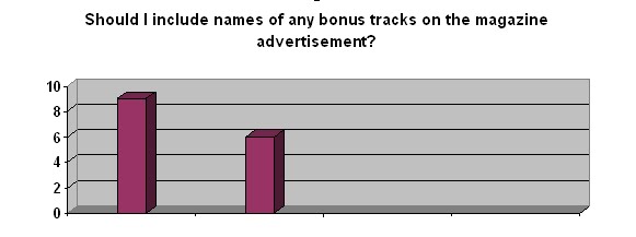
Clearly, my audience would like to see what particular bonus tracks will be included on 'The Lightning's' album through the magazine advertisement. Therefore, I will make sure that this is included. However, as 9 people out of the 15 preferred this alternative, I still wish to take into consideration the opinions of the other 6 respondents which did not think that bonus tracks were that important in the advertisement of the album. So, I have decided that I will include only one bonus track on the magazine advertisement instead of the two. This way, I am trying to compromise with both oppositions of my audience's feedback.


My audience feedback has shown me that a teaser type image would not be that necessary. This, I was in fact surprised with, therefore I asked personally one of my respondents who thought that this was not necessary why they thought this, and they replied ''This would not show a correlation between the advertisement and the album cover as the album cover has a simplistic design and layout''. This made me realise that this was in fact true, especially with a front cover such as mine. As a result, I shan't use this convention. I also have come to realise that this convention is very rare, which shows a sign of uniqueness, however, as it is such a rarity, some people may not resemble it as something which should appear on something such as a magazine advertisement.


Exactly as I thought, my audience respondents have made a preference of wanting my magazine advertisement to be similar to my album cover. Even if I did not devise a questionnaire, this is something I would have made a decision on as the majority of the magazine advertisements I have viewed shows a very strong correlation with the album it is advertising.

Sunday, 14 March 2010

Magazine Advertisement Questionnaire


To be able to create a magazine advertisement that would be suitable for my target audience, I thought it would be a good idea to gain some audience feedback before the actual creation of it. Therefore, I know what particular conventions to use to gain my audiences attention as they would have had some input on my final draft. Again, I will post this questionnaire on networking sites such as MySpace and Facebook as by doing this, I will be able to gain my audience feedback at a faster rate compared to giving them to people in person to fill out.

Friday, 12 March 2010

Relation to Magazine Advertisement

Today, I was in HMV, and whilst I was glimpsing at albums, I straight away noticed that Seasick Steve's album stood out at me. This was because one of my magazine advertisements analyses was for his album and I immediately noticed the synergy between the actual album cover and the magazine advertisement. This is how I want people to notice the relation between my digipak and my magazine advertisement - the way I did with Seasick Steve.

Friday, 19 February 2010

Album Magazine Advertisement's Analysis

After looking at the conventions of magazine advertisement's, I thought it would be useful to do some analyses of three different magazine advertisements that advertise albums to look at their presentation, and the ways in which certain artists decide to make synergy between their album cover and their magazine advertisement.

Here at the few I chose to analyse.

Conventions of Magazine Advertisements

Just by looking at a range of magazine advertisements, it is clear to see the generic conventions of them as nearly all magazine advertisements consist of similar aspects. Here is a list of what I have found present in the majority of the magazine advertisements I have glanced at:

- Name of the album

- Record Label

- Picture/Symbol

- Extras (Bonus Tracks)

- Tour Dates

- "Limited Edition"

- Outlets in which to buy album

- "OUT NOW"

- Release Date

- Websites/Myspace Links

- Reviews/Endorsements

- Star Rating

- Debut Album

- Slogan

Thursday, 18 February 2010

Magazine Advertisement - Second Ancillary Task

After creating our digipaks, our second ancillary task is to create a magazine advertisement which demonstrates a correlating relationship between the digipak and the magazine advertisement. In order to gain the outcome in which I am hoping to construct, I have a list of things in which I am going to focus on in order to produce a magazine advertisement of a high standard. I am going examine aspects such as:

a) Research - looking at designs, colours, images, font types, layout, mise-en-scene, texture used in other magazine adverts for my genre.

b) Using similar (if not identical) designs, colours, images, font type, layout, mise-en-scene, texture in my magazine cover as I have for my digipak.

c) Being able to show links between my digipak and magazine advert with my music video.

d) Making my digipak and magazine look as professional and realistic as possible.


By looking at these aspects which appear crucial in the creation of my magazine advert, I have thought of a few extra aspects which I could possibly include in the construction of my magazine advert which will also contribute to the correlating relationship between my magazine advert and my digipak. I could think of including:

- Possibly add a teaser type image.

- I want the audience to relate the colourscheme and typography together.

- Continuity in font type - continuity shows relation.

- Connotations of language.
.
- Link to target audience.

- Textuality - inter textuality = propaganda.