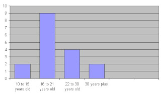
Out of the 17 candidates that responded, 7 of them were males and 10 of them were females. This shows that there is not much noticeable difference in the gender preference when relating this to the statistics of the other questions. This could show a relatively high rating of validity when looking at peoples preferences.

The majority of the candidates that responded were between the ages of 16-21 which is the age group of the media group and myself, therefore it might be easier to relate to what my target audience is looking for with the designs I choose for my digipak as I would also be able to reflect what would attract me. Hopefully this will take into consideration the interests of many 16-21 year olds making my digipak attractive to the eye of those between these ages.

I gave the candidates options as to how many panels they believe would be most suitable for a digipak. By looking at the graph, it is clear to see that the majority of people would say that 4 would be most suitable for a digipak, 8 people agreed with this. However, 6 other candidates voted that 6 would be a more suitable amount for a digipak. In result to this, I have decided that as there is not much difference in the statistics showing how many voted for a digipak consisting of 4 or 6 panels, I will make my digipak consist of 6. The reason for this is because in my research of digipaks, it was very rare that I came across a digipak consisting of 4 panels as the majority of them had 6. Therefore I am going to conform to the generic conventions of digipaks when in the process of creating my own.

Also, this graph shows that the majority of people would prefer bright and bold colours opposed to dull colours. I think that this would be very convenient when relating this back to my music genre as bright and bold colours stand out the way in which our song stands out to all people,including those who aren't really into the pop/rock genre. For this reason, this links my digipak in with my music genre.
I also had answers generated from other questions such as 'What grabs your attention on an album cover?'. The majority of people voted for bright colours and only a minority voted for a photograph of the band or artist and graphics. However, I am still going to try and attempt to somehow include a bit of everything to make my album cover have a more varied image that could relate to the minority as well as the majority.
Moreover, another question that I found relevant that I generated answers from were 'What are you mosty likely expecting to see on a Pop/Rock album cover?'. Out of the options of 'symbolic imagery', 'photograph of band/artist' or 'graphics', a high percentage voted for symbolic imagery which I thought would be an option I would chose if I was to not conduct a questionnaire. In result to what would attract a major audience, I am definitely going to choose symbolic imagery as a way of creating my digipak. However, I am still going to attempt taking into consideration the minorty by considering graphics and photography of my band or solo artists as a means of making my outcome appeal to everyone and not just the majority.

No comments:
Post a Comment