Monday, 28 December 2009

Band or Solo Artist?

Whilst editing our music video, the production team and I were starting to think about the artist/s of our song due to the fact that this issue is relatively essential when designing an album cover. We are taking into consideration the image of the artist/s as we have specific target audience criteria to work in collaboration with for example the age group and gender we are trying to attract.


Ke$ha


Kesha is a contemporary American pop artist who began her solo career in early 2009. She was originally a backing singer for bands such as ‘The Veronicas’ and solo artists such as Britney Spears. Her fame mainly began when she appeared to be featuring in the debut song ‘Right Round’ with Flo Rida, then in late 2009 became even more popular amongst the youth when she released her single ‘Tik Tok’. In my opinion Kesha has the typical image of a pop/rock star. Her image would relate me back to the song to our music video ‘Superman’ as her individual style relates to our music genre. Also, she attracts the target audience which we are aiming to grab attention from as well.


Paramore


Paramore is an American rock band that is well known in many countries. The members consist of 3 boys and a girl who is the lead singer. This particular band had caught my attention when looking for rock bands which could have a similar genre to that of our production team due to their multi-coloured outfits and the lead singer. This is because in the song we are promoting, we also have a lead female vocalist. However, in the majority of their songs they have dominant beating of drums, this again reminded me of our song as we also have dominant beating of drums at the beginning and throughout the song. Therefore, I have come to the conclusion that if the group and I decide that our song would be promoting a band, they would have a similar image to that of Paramore.

Even though the majority of my artist research is based on solo artists, for example Avril Lavigne, I feel that a band would be a more suitable way of promoting our song ‘Superman’ as bands are more adaptable to peoples personal taste compared to solo artists. Additionally, due to our song having many instruments being played that are immediately distinct, a band would get more acknowledgement and recognition from the audience for playing their own music instead of using the help of Garageband.

Monday, 21 December 2009

Some of the most famous album covers!

Nirvana : Nevermind


Nevermind is the second studio album by the American rock band Nirvana, released on September 24, 1991. Produced by Butch Vig, Nevermind was the group's first release on DGC Records. Frontman Kurt Cobain sought to make music outside of the restrictive confines of the Seattle grunge scene, drawing influence from groups such as the Pixies and their use of loud/quiet song dynamics.

The Nevermind album cover shows a baby swimming toward a US dollar bill on a fishhook. According to Cobain, he conceived the idea while watching a television program on water births with Grohl. Cobain mentioned it to Geffen's art director Robert Fisher. Fisher found some stock footage of underwater births but they were too graphic for the record company. Also, the stock house that controlled the photo of a swimming baby that they subsequently settled on wanted $7,500 a year for its use, so instead Fisher sent a photographer to a pool for babies to take pictures. Five shots resulted and the band settled on the image of a three-month-old infant named Spencer Elden. There was controversy about having a naked baby featuring on the album cover therefore Geffen found an alternative to have a sticker covering the baby's genitals.


Pink Floyd : Dark Side of the Moon


The album was originally released in a gatefold LP sleeve designed by Hipgnosis and George Hardie, and bore Hardie's iconic dispersive prism on the cover. For The Dark Side of the Moon Richard Wright instructed them to come up with something "smarter, neater—more classy". The prism design was inspired by a photograph that Thorgerson had seen during a brainstorming session with Powell. The artwork was created by their associate, George Hardie. Hipgnosis offered the band a choice of seven designs, but all four members agreed that the prism was by far the best. The design represents three elements; the band's stage lighting, the album lyrics, and Richard Wright's request for a "simple and bold" design. Added shortly afterwards, the gatefold design also includes a visual representation of the heartbeat sound used throughout the album, and the back of the album cover contains Thorgerson's suggestion of another prism recombining the spectrum of light, facilitating interesting layouts of the sleeve in record shops. The light band shining out from the prism on the album cover has six colours, missing indigo compared to the traditional division of the spectrum into red, orange, yellow, green, blue, indigo and violet. A normal prism would also exhibit a continuous spectrum with no defined boundaries between colours, and coloured light within the prism. Inside the sleeve were two posters and a sheet of pyramid-themed stickers.


Herb Alpert : Whipped Cream and Other Delights


Whipped Cream sold over 6 million copies in the United States and the album cover alone is considered a classic pop culture icon. It featured model Dolores Erickson wearing chiffon and shaving cream. The picture was taken at a time when Erickson was three months pregnant. The cover was so popular with Alpert fans that, during concerts, when about to play the song "Whipped Cream", Alpert would tell the audience, "Sorry, we can't play the cover for you!" The art was parodied by several groups including once A&M band Soul Asylum, who made fun of the liner notes along with the back cover on their album Clam Dip & Other Delights, comedian Pat Cooper on his album Spaghetti Sauce and Other Delights.

Friday, 18 December 2009

Editing Cont...(Part 2)

On the 16th of December the whole media group and I went to the City Learning Centre to gain more essential information about the new software 'iMovie' which we found difficulty using since it was drastically more updated compared to the version which we used in the previous year. A few months prior to the 16th of December, we went to the City Learning Centre to gain confidence in the understanding of the use of the programme 'Garageband', however we did not put this programme to use due to reasons explained previously. Nonetheless, we enjoyed our trip due to the fact it gave us the amazing opportunity to have inspiration with editing techniques when composing our music video together with a person which had many years of experience with the Mac software.


Firstly, on our own, we assembled the clips to have transitions which we in time to the beat of the music at the beginning of the music video. We then gained feedback from the person who was training us with this software and he explained to us why our transitions were too slow and not exact to the beats of the music. Regardless of this, our assistant enabled us with a new technique which ordered us into doing this technique effectively by adding time markers to each beat of the song we wanted the clips to change on resulting in our timing being much more efficient towards the beats of the music.


Another problem which we managed to overcome was the transition which we gained influence from Blink 182's music video. We came to realise that the iMovie software did not cater this transition therefore we had to reassemble our thoughts, and in the end we concluded with the 'wipe' transition from left to right with certain clips to help reassure the audience with each character making them unconsciously noticing their different stereotypes.


Monday, 14 December 2009

Editing

Today's date is one of our first whole lessons to attempt editing our now uploaded promotional music video. Again, we researched on YouTube a variety of videos which could help us to have an even more profound understanding of how to use the version of iMovie which we were still not 100% confident with. One of our first tasks which was essential in the editing of our scenes was to crop them to make them immaculate. There were a few scenes which we recorded that had areas of certain rooms showing which made the overall image of the scenes inconsistent and disheveled. Therefore we researched specific videos on YouTube which was giving tips for cropping, and as a result we successfully managed to crop the scenes that we intended on doing. Also, we adding in specific transitions after experimenting with them in the process of uploading the film. In certain scenes such as the ones consisting of lip synchronization the production team and I decided that adding in a cartoon transition would be most effective in the efforts to enhance the 'Superman' cartoon like feel towards the video as we relate Superman to the Marvel comics.

Sunday, 13 December 2009

History of Album Cover Design

An album cover is the front of the packaging of a commercially-released audio recording product, or album. The term can refer to either the printed cardboard covers typically used to package sets of 10" and 12" 78 rpm records, single and sets of 12" LPs, sets of 45 rpm records (either in several connected sleeves or a box), or the front-facing panel of a CD package, and, increasingly, the primary image accompanying a digital download of the album, or of its individual tracks.

The cover has 3 main functions:
1) To advertise the contents of the music product.
2) To convey the artistic aspirations of the original artists.
3) In reproductions of the artwork, to serve as a primary image in the promotional efforts surrounding the product, as an identifiable image associated with it.

Early History...

Around 1910, 78 rpm records replaced phonograph cylinder as the medium for recorded sound. The 78 rpm records were issued in both 10" and 12" diameter sizes and were usually sold separately, in brown paper or cardboard sleeves that were sometimes plain and sometimes printed to show the producer or the retailer's name. Generally the sleeves had a circular cutout allowing the record label to be seen. Records could be laid on a shelf horizontially or stood upright on an edge, but because of their fragility, many broke in storage.


More Recent Design...

The cover became an important part of the culture of music at the time. As a marketing tool and an expression of artistic intent, gatefold covers, (a folded double cover), and inserts, often with lyric sheets, made the album cover a desirable artifact in its own right. Notable examples are The Beatles Sgt. Pepper's Lonely Hearts Club Band which had cut-out inserts, lyrics, a gatefold sleeve though a single album; and Pink Floyd's The Dark Side of the Moon which had gatefold, lyrics, no title on the sleeve and poster inserts. The move to the small (less than 1/4 the size of a record) CD format lost that impact, though attempts have been made to create a more desirable packaging for the CD format, for example the re-issue of Sgt. Pepper, which had a cardboard box and booklet, or the use of oversized packaging.


The Beatles : Lonely Hearts

Pink Floyd : Dark Side of the Moon

Friday, 11 December 2009

Uploading Our Film


In today's lesson the production team and I uploaded our filming onto the Mac computers to enable us to begin making a start on our editing using the most updated version of iMovie. The team and I were very confused to begin with since the new version of iMovie was very different to the one in which we used last year. We went onto YouTube to look for videos which could possibly give simple instructions on how to do simple effects as we did not even know how to do something as simple as that. We finally found a YouTube video which helped us to understand more about applying transitions. We experimented with the transitions and applied a few even though we were not intending on actually using them as we just wanted to feel more confident about how to use certain transitions and how to apply them effectively. We accomplished how to use them after a while and we all felt relatively comfortable, however we wanted to make certain scenes tinted red, but we soon managed to realise this would not work due to this not being an option.

Monday, 7 December 2009

Filming Cont...

- Today, the production team and I made the effort to finish off filming our last scenes for the music video after realising we did not have enough tape to cover the whole three minutes we were aiming to produce for the music video. Our original storyboard had scenes altered and deleted and what we proposed doing was to finish off filming the areas we added in so that our final outcome would match our new and updated storyboard. However, this meant we had to carefully think of the locations we were intending on using.

- Reena ( main girl character) made an attempt to film the 'Superman' scenes with Krishna ( the male playing the part of Superman ) and herself enjoying each others company and having fun with one another to show their fun and young relationship they were building on, as part of the storyline. We all agreed that domesticated areas such as living rooms and bedrooms would be most suitable for these particular scenes to emphasise the comfort found in one another by both characters.

- Another scene was set in a park in the childrens' play area. The change of setting symbolises the changes in their relationship as their relationship is growing stronger the more they get to know each other and spend time with one another. Therefore, the settings regards their perspective of each other. Also, the childlike play area shows that they are able to have fun together and act immature - this can relate to marvel as an inspiration that we researched into when choosing 'Superman' as the name of our song.

- Furthermore, the costumes allocated for each character are similar to what was worn in previous scenes, however some areas of clothing are somewhat different. This is also another aspect of a change in the relationship which is being built, however this could appear as a non-continuity error. An aspect of the character's attire is that the girl is wearing 'Superman's' cardigan whichs symbolises a sense of sharing in the relationship.

Sunday, 6 December 2009

Filming

On the 5th of December, the production team and I began our filming for the production of our music video. We had made a schedule to begin filming at 10am however this did not materialise due to many complications. One of the difficulties we managed to swiftly overcome was our plan to film at April's house in her living room due to it being very spacious and convenient for our 'dating scenes', however this resulted in being very disruptive towards the family which resulted in us not being able to use that location we intended on. Therefore, we had no choice but to change the location. This proved a hassle as many aspects such as the mise-en-scene and the lighting were going to be very different to what we originally had in mind. Nevertheless, we all reconsidered the design of these particular scenes and reshaped them to what would mould perfectly into the mise-en-scene of another production team members bedroom. The angles were slightly different, however still overall successful for us to be able to begin filming at approximately 12pm. This consequently gave us a sufficient amount of time to get the majority of the main scenes filmed as we had already planned to make a huge effort on filming most of our scenes on this date. We also wanted to film the majority of the films on this date because this would enable all of the characters to look exactly the same in every shot and it would also contribute to more time for editing once filming was over.


Here in an example of a scene we managed to film. We managed to film all three male characters walking down the road to emhance their role and stereotypes. We used this as a way of creating a jump cut effect to create the massive contrast between the various personalities. This also makes it unambiguous that all three male characters are going to the same place - enhanced through jump cut effect.


Here is an example of a complication we managed to overcome. This is an example of a 'dating scene' which we had to change. This location apparent here is that of Reena's bedroom which was our last resort. As a result, the scenes were grainy and not as clear as what they would have been in our first considered location. On the other hand, the grainy image could work in collaboration with the idea of a romantic feel.


Extreme close ups were other shots we managed to film which helped to emphasise each characters attire, for example, here is a screen shot of the 'Geeks' bow tie which helps the audience to accommodate themselves with the stereotypes before seeing each character as a whole.

Friday, 4 December 2009

Album Covers

As part of one of our ancillary tasks, we have to produce an album cover for our music video production. Therefore, to make a start on album covers I thought it would be productive and constructive if I were to take three album covers from my music genre and analyse them. By doing this I will gain inspiration for the album cover I am hoping to produce as I am hoping to develop an album cover which will directly catch the attention of all audiences. The album covers I decided to analyse is Pink’s album ‘Funhouse’, Katy Perry’s album ‘One Of The Boys’ and lastly, the artist I am following – Avril Lavigne’s ‘The Best Damn Thing’.


Here are the analysis's I have made of the following album covers...


As Avril Lavigne is the artist I am following throughout my project, I have decided to compare her most recent album to one of her older ones. Firstly, here is an analysis of her album cover for the front of the album and the back also.


Comparing Avril Lavigne’s album ‘The Best Damn Thing’ to her first album ‘Let Go’, there is a difference in the use of generic album cover conventions. For example, Avril Lavigne’s name on the front of the album cover does not stand out against the name of the album. This could possibly be challenging the album cover conventions compared to ‘The Best Damn Thing’ as usually the artist’s name would be somewhat striking compared to the album name to immediately catch the attention of the audience when placed on a shelf next to a number of albums.

A similarity between both album covers in which Avril Lavigne has proposed is that she appears to relatively still have the same style of a punk/rock girl due to the colour scheme of her outfits. However, her use of fashion in more recent years tends to become more colourful but only slightly as she tends to where the colour white more often. This could possibly be illustrating that as time goes on she is growing up and becoming more of a woman who sees the world through a more clear perspective. Whereas on the album cover ‘Let Go’ she is wearing all black which could hold connotations of someone who is mischievous and gets into trouble? So, the slight colour change could be demonstrating the process of her maturing.

The background of the album ‘Let Go’ is blurred and gives the audience a sense of dizziness. This could possibly be a way of demonstrating the feeling of being drunk or possibly on drugs. Avril Lavigne’s sense of fashion and public image would link to the background and the audience would associate this with people of the same stereotype.

‘The Best Damn Thing’ does not particularly challenge the conventions as much as what ‘Let Go’ does because her older album does not necessarily appear to be an album cover at all as the artists name is not striking in any way, there is not the name of any well known songs which has the chance of catching the audiences eye and there is not the use of bold colours which are prominent. Whereas her most recent album ‘The Best Damn Thing’, commit more so to the generic album cover conventions due to the striking image of Avril Lavigne, her name is noticeable next to the album’s name and the album would generally stand out to the audience’s attention when placed on a shelf compared to her older one.

Thursday, 3 December 2009

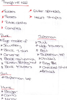
List of Props

We made a list of props that we would need to bring for our shoot day. By doing this, it helped us to put into words the materialistic things which would help to keep up the image of each character and the scenes we are hoping to propose.